Line chart
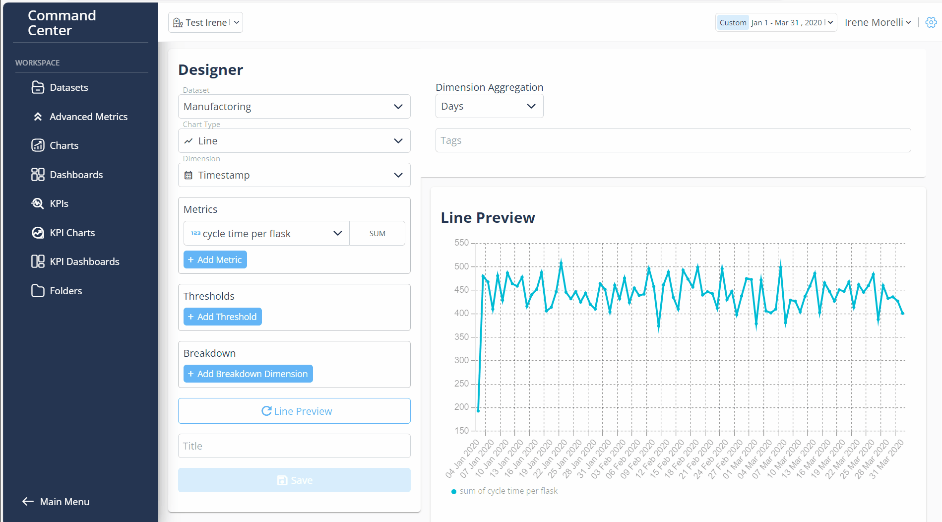
Before you begin, verify that the dataset is created and uploaded in Dataset Menu bar.
- Log in Command Center Console as Admin/SuperAdmin
- From the Menu bar select Charts
- Click on + New Chart button
- In Datasets dropdown, select a dataset
- In Chart type dropdown, choose Line
- In Dimension field, choose dimension
- In Metrics field, select any metric
- Choose an aggregation for chosen metric
- Click + Add Threshold to add Threshold
- In Value field, enter the thresholds value
- In Label field, enter any label for Threshold (e.g. Target)
- In Color dropdown, select color for Threshold
- In Title field, insert title of Line Chart
- Select Dimension Aggregation by Days, Weeks, Months, Quarters, Years
- In Tags field, enter any tag and press "Enter" button
- Click Line Preview button
- Click Save button
- Created Line Chart is in Charts > Charts Library
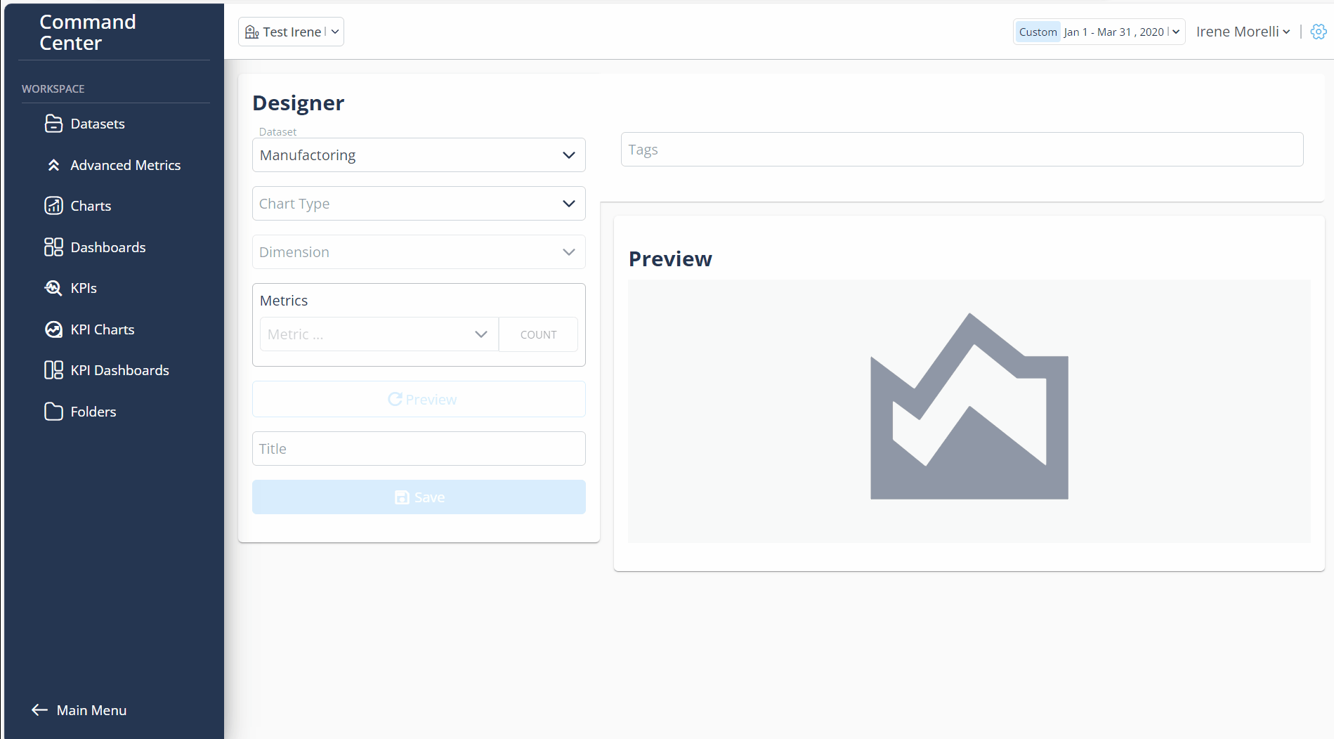
Additional feautures
- Breakdown Dimension:
- Click + Add Breakdown Dimension to breakdown selected metric
- Select any metric