Organize chart visualization
Organizing chart visualizations on a dashboard involves thoughtful planning and design to ensure clarity and effectiveness.
Here are some guidelines to help you organize chart visualizations on a dashboard :
Define Purpose and Audience: Clearly understand the purpose of your dashboard and identify the target audience. Tailor the chart selection and arrangement based on the information needs of the users.Prioritize Information: Prioritize key information and place the most important charts prominently. Arrange charts based on the significance of the data they convey.Size and Proximity:Adjust the size of charts based on their importance and the amount of information they convey. Place related charts in close proximity to enhance the understanding of relationships.Use Colors Wisely: Use a consistent color scheme for charts to maintain visual coherence. Employ color strategically to highlight important data points or trends.Clear Titles and Labels: Ensure each chart has a clear and concise title. Label axes and data points appropriately for easy comprehension.
Dashboard organization steps
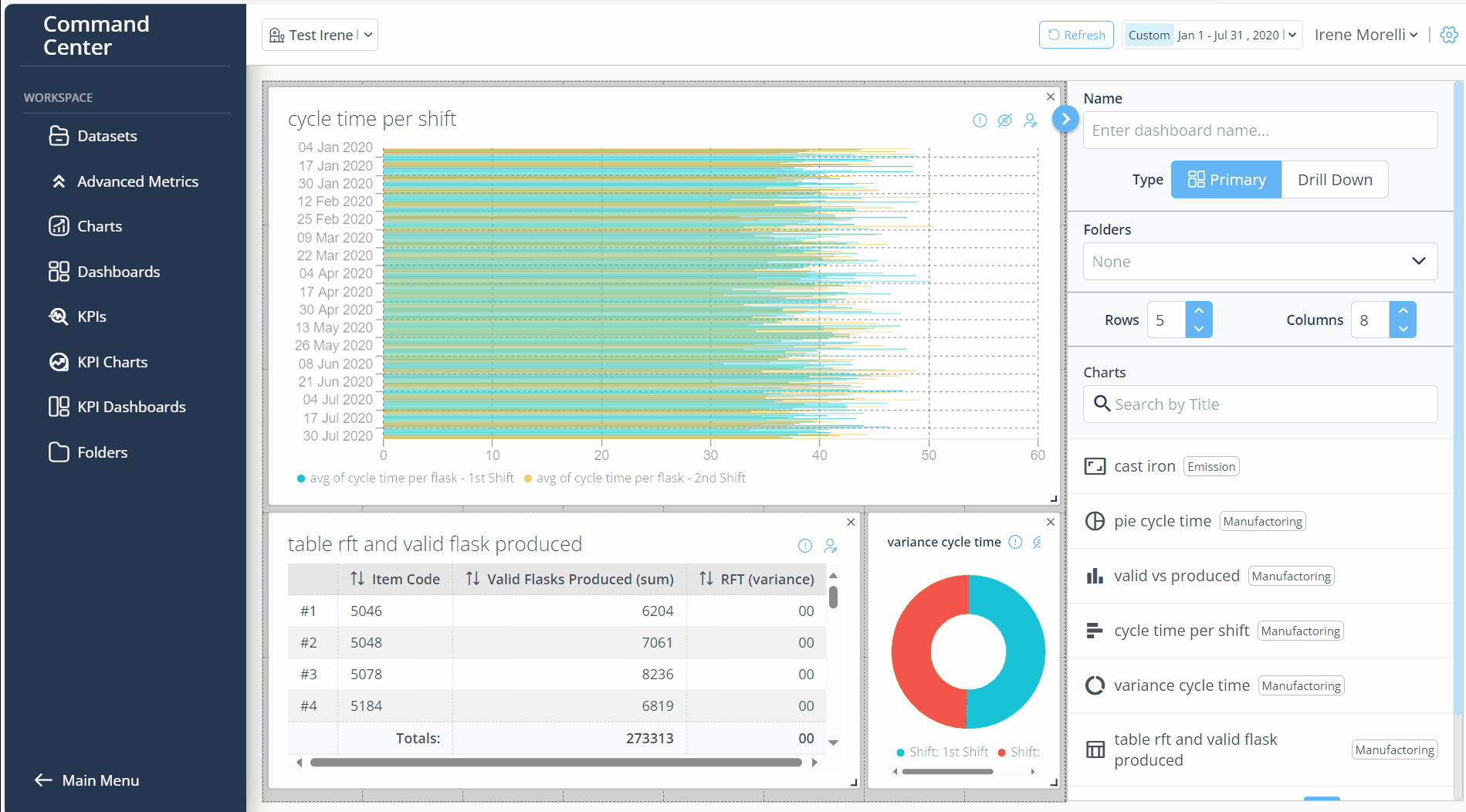
While you Added charts from Chart Library on a Dashboard you can:
Resize a chart by expanding the corner of the chart or delete it by clicking on x in the upper right corner.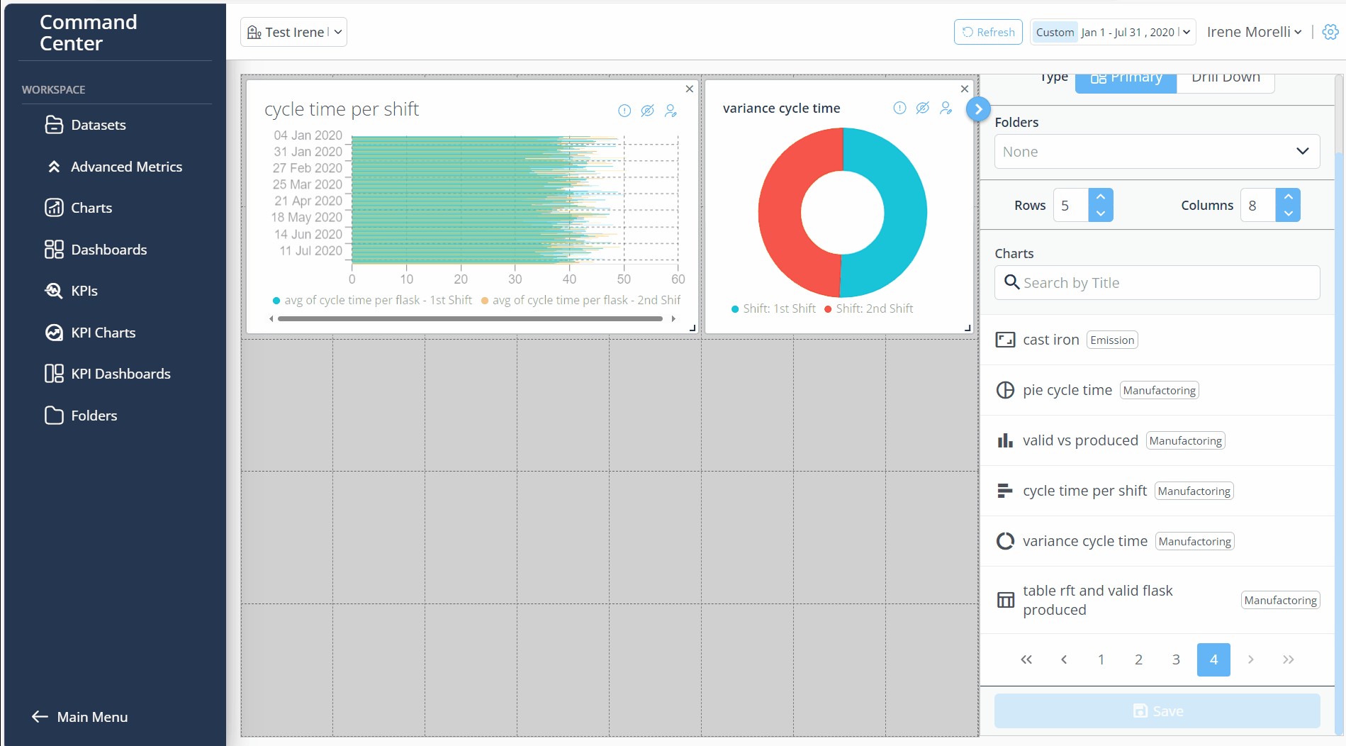
Arrange the created charts by moving them as you wish on the dashboard and adjusting the number of rows and columns.
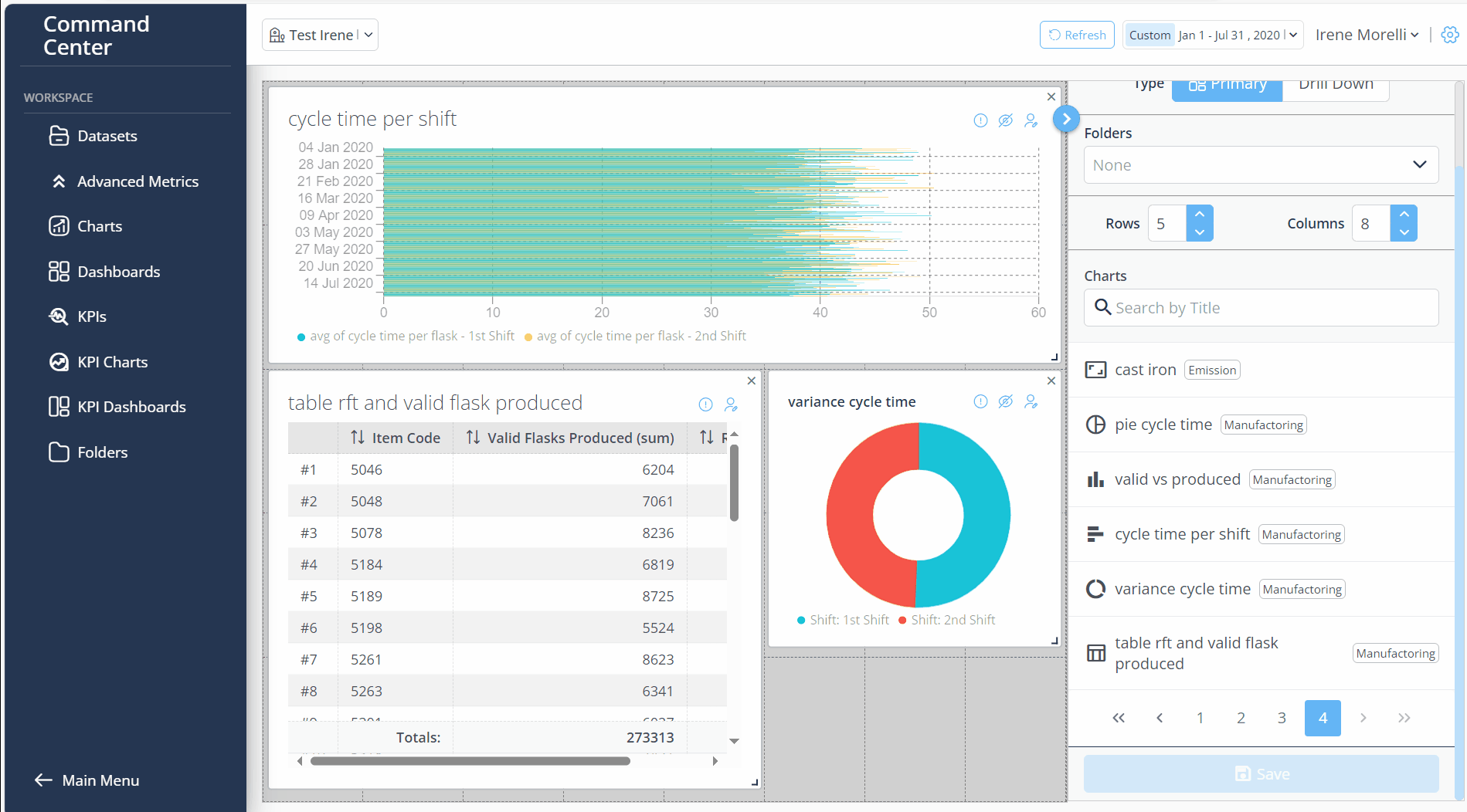
To Save your creation follow next steps:
In Name field, insert the Dashboard title
From the Folder dropdown, choose one or more folders to associate with the dashboard.
Click Save button
Created Dashboard is in Dashboard > Dashboard Library