Filter
In dashboard visualization, filters are a crucial component for refining and focusing the displayed data. Filters allow users to interact with the dashboard, selecting specific criteria or values to view only the information they are interested in. Here are some applications of filters in dashboards visualization:
Data segmentation: Filters allow users to segment data based on specific criteria. User might want to view data for a specific region, product category, or any other relevant dimension.Geographic Filtering: enable users to narrow down data to a specific location or region. This is valuable for businesses with operations in multiple locations or for analyzing regional performance.
Product or Category Filtering: users can filter data by product, service, or category to analyze the performance of individual items or groups. This is common in sales, inventory, and marketing dashboards.
Interactive Exploration: Filters provide an interactive exploration experience. Users can experiment with different filter combinations to analyze data from various perspectives, helping in uncovering insights.Filter Display: The selected filter criteria are displayed on the dashboard, providing users with a clear understanding of the applied filters and helping them maintain context.
In summary, filters in dashboard visualization empower users to control and tailor the displayed data, facilitating a more personalized and insightful analysis of information. They enhance the user experience and contribute to the effectiveness of data-driven decision-making.
Filter creation
Before you begin, verify that the dataset is created and uploaded in Dataset Menu bar.
- Log in Command Center Console as Admin/SuperAdmin
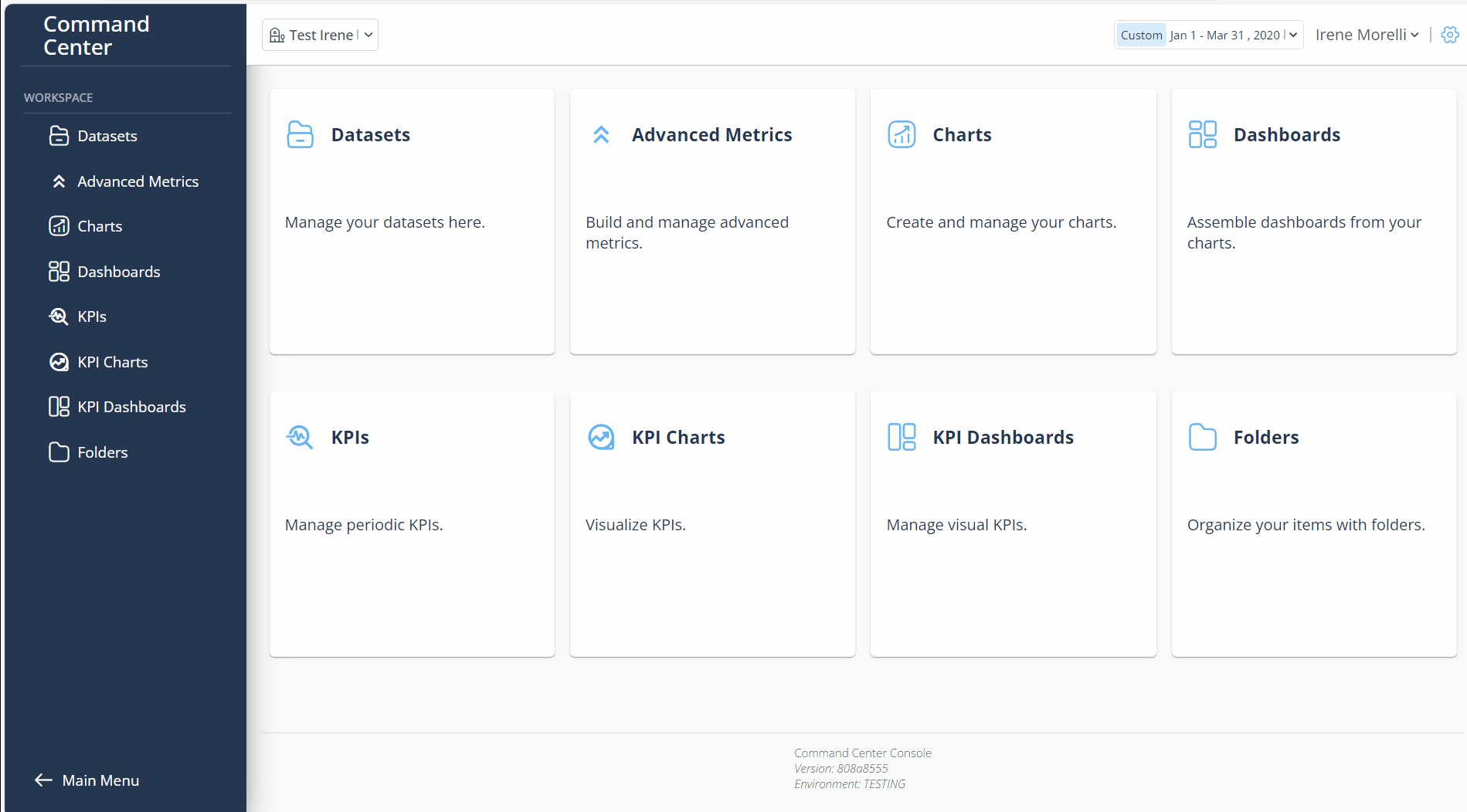
- From the Menu bar select Charts
- Click on + New Chart button
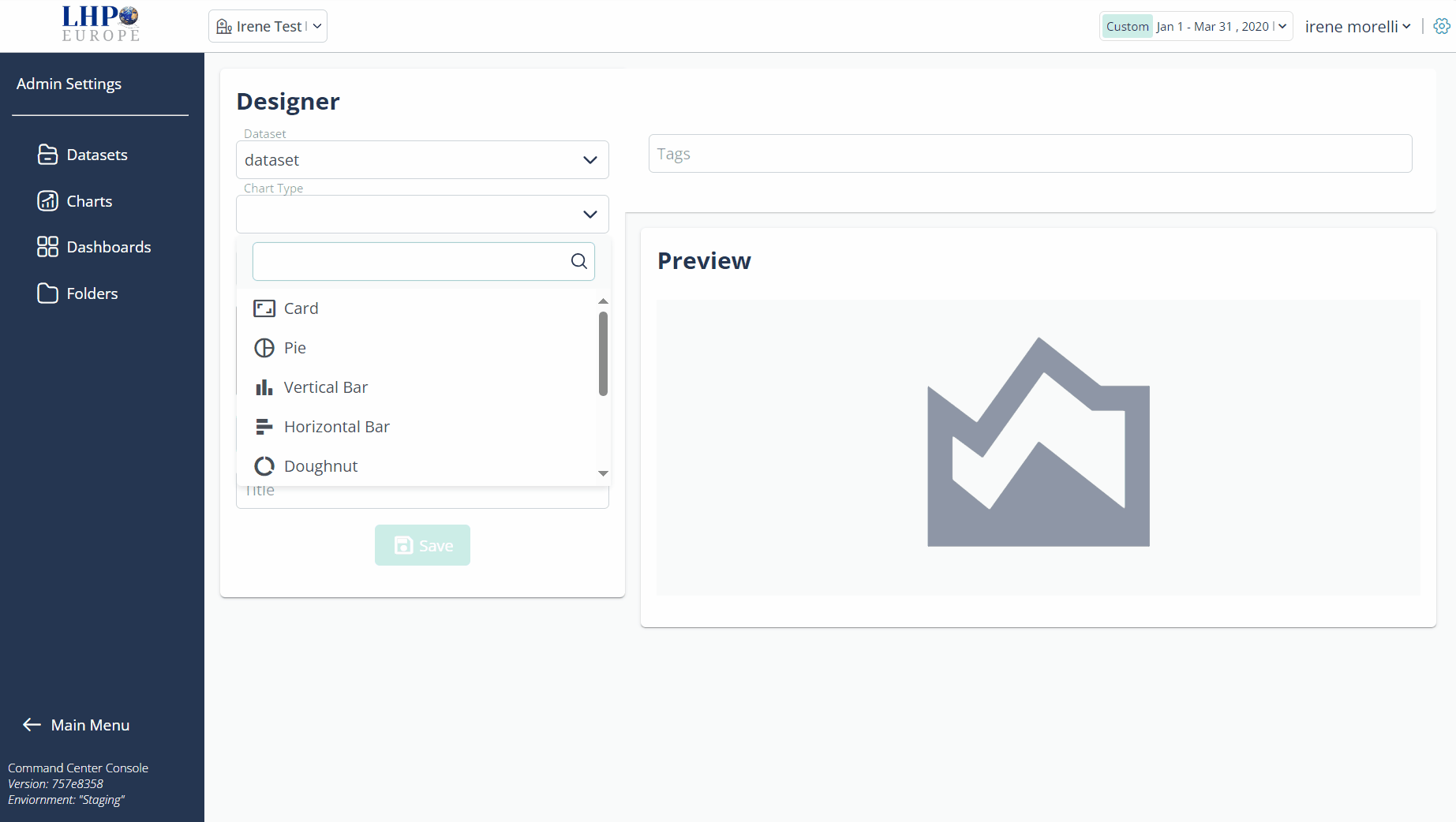
- In Datasets dropdown, select a dataset
In Chart type dropdown, choose Dimension Filter (allows to visualize all charts with respect to a specific category, facilitating focused analysis).
In Dimension field, choose dimension (the command center will automatically display exclusively the timestamp/categorical ones)
In Title field, insert title of Dimension Filter
In Tags field, eneter any tag and press "Enter" button
Select Dimension Aggregation by Day, Months, Years
Click Dimension Filter Preview button
Click Save button
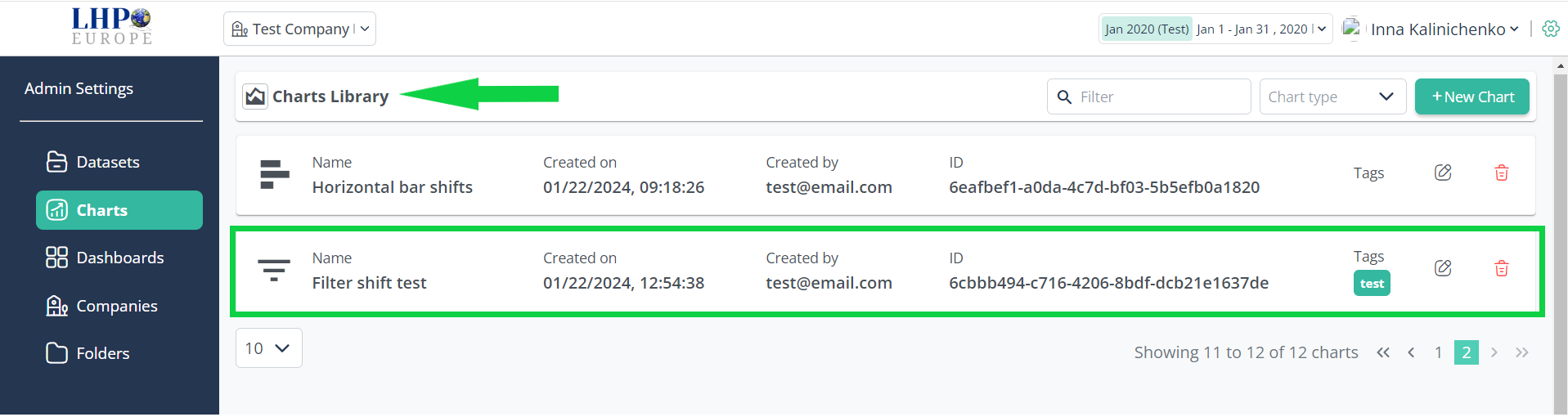
- Created Filter is in Charts > Charts Library
Filter visualization
- Go to Dashboards, create a Dashboard with a Filter by clicking + New Dashboard
Dashboard creation page opens
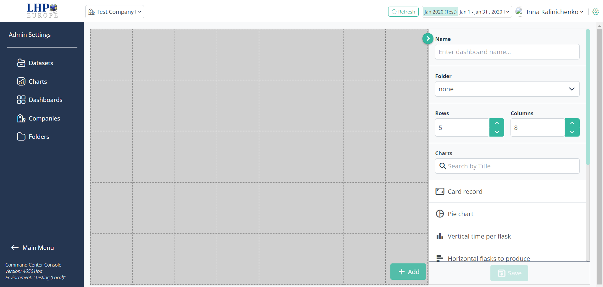
Add Filter and other charts from Charts
In Name field, insert title of Dashboard
From the Folder dropdown, choose the folder to associate with the dashboard.
Click Save button
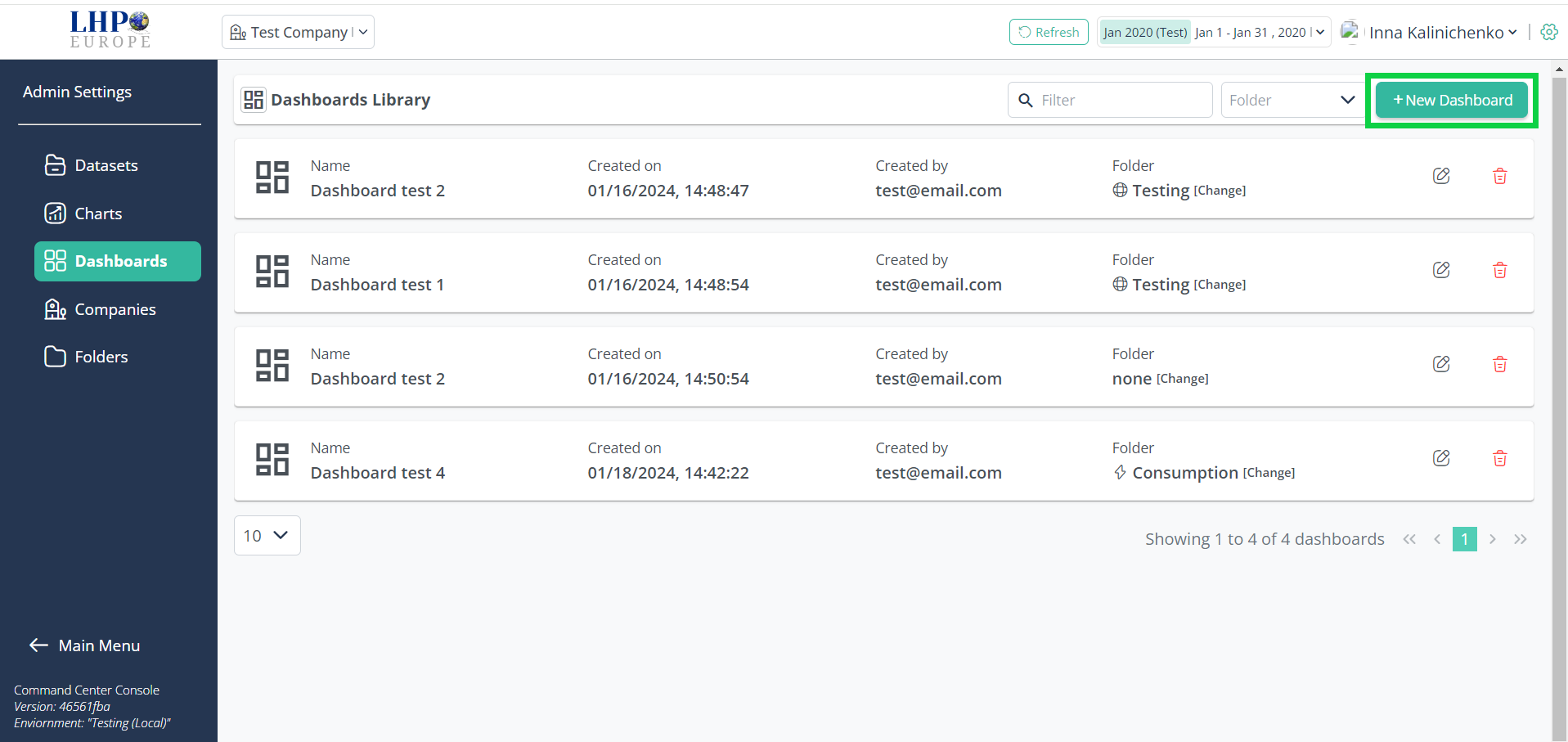
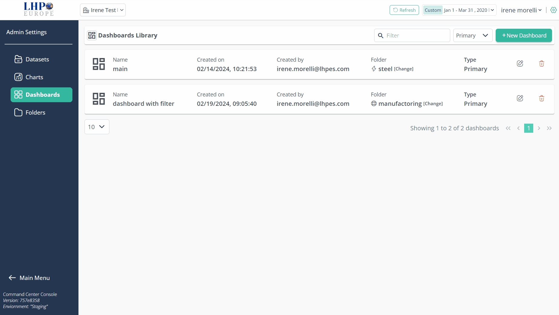
Created Dashboard is in Dashboards > Dashboards Library
Clicking on Main Menu in the bottom of the Menu side bar, the page with all created Folders appears
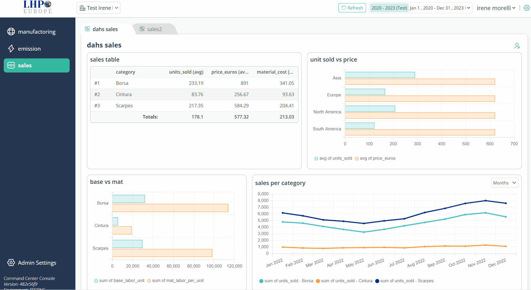
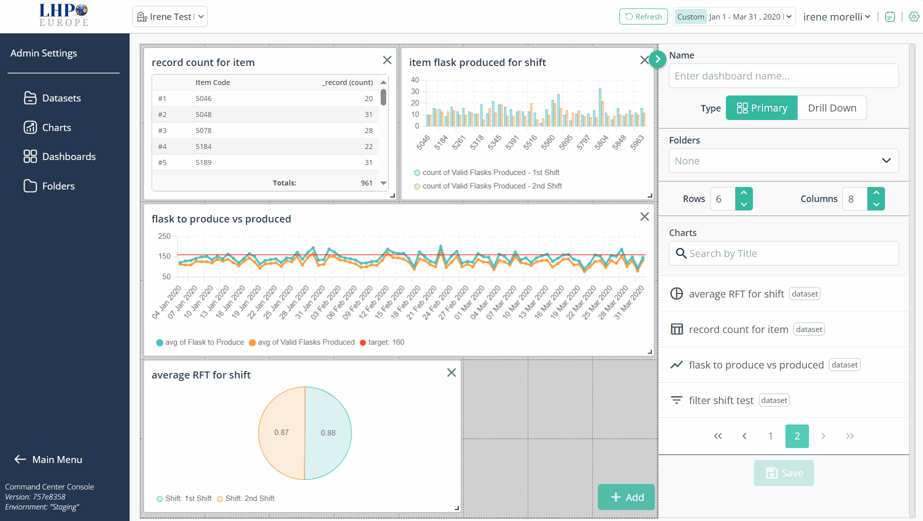
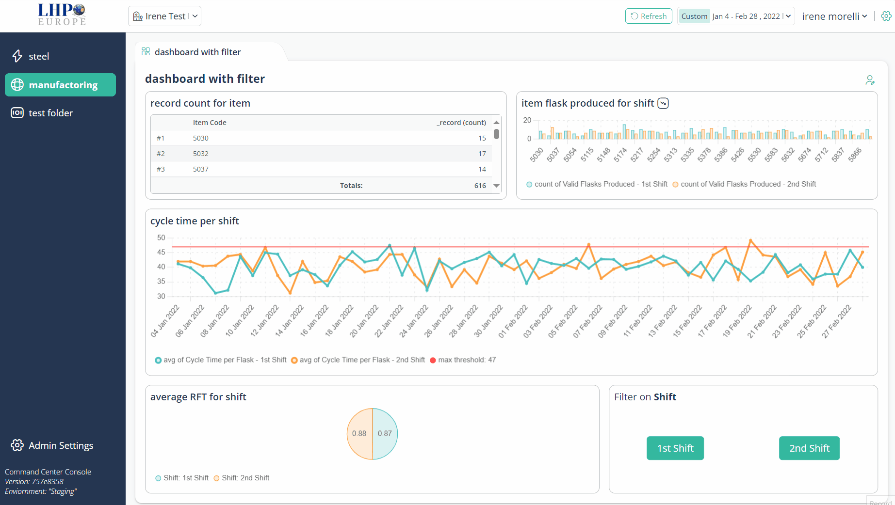
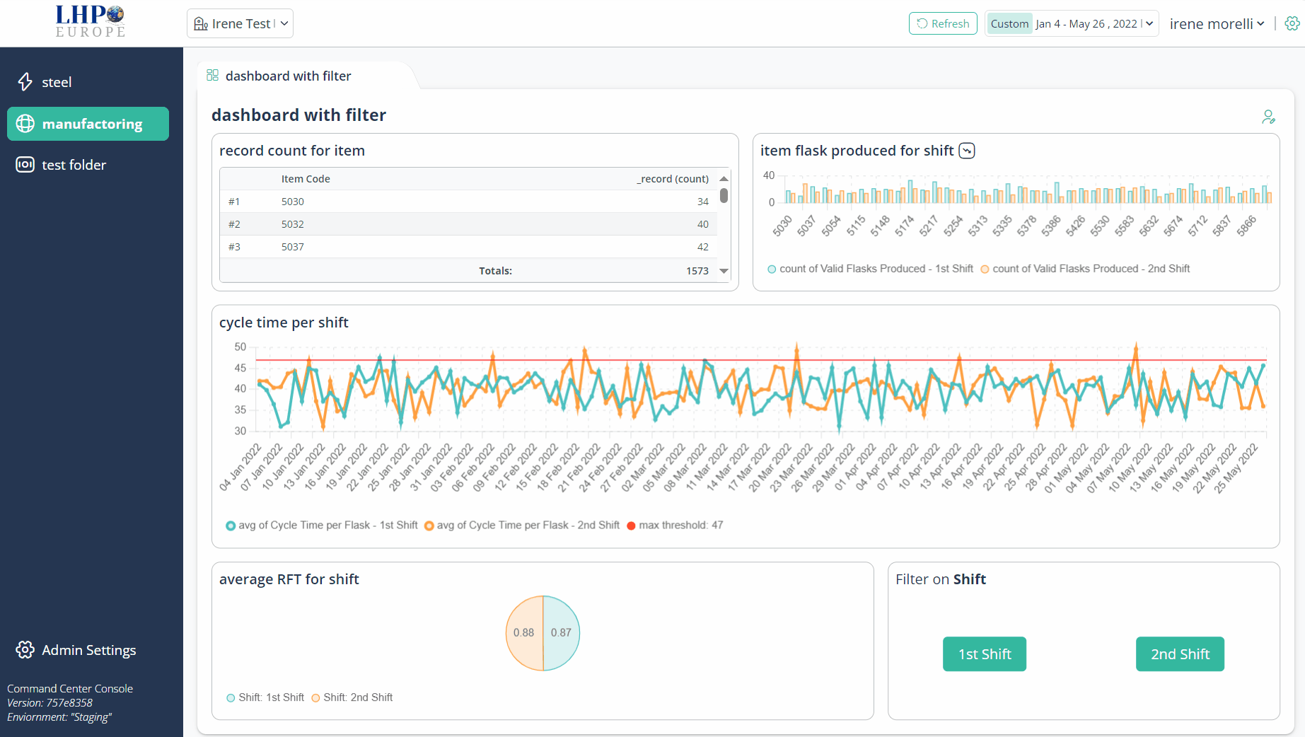
Select a Folder to which you've associated the Dashboard (in our case it is "manufactoring"). All dashboards associated with this Folder will appear. Select the newly created dashboard containing the filter
To filter values on the Dashboard, click on Filter chart presented value (e.g. 1st Shift). All chart's values on the Dashboard will be filtered by the 1st Shift or 2nd Shift
To reset a filter, click x on the filter icon or click again in the same filter button
Filtering single charts
The Command Center also enables users to filter single charts directly during dashboard visualization, interacting with the charts.
Visualize your dashboard
Click directly on the variables name inside a chart
Filtering from chart within the dashboard
An alternative method for data filtering involves interacting with the chart itself.
Table chart
- Visualize your dashboard
- Click on the table row, corresponding to the element you wish to apply the filter to.
- To reset the filtering, click x on the filter icon
Pie/Doughnut charts
- Visualize your dashboard
- Click on the slice, corresponding to the element you wish to apply the filter to.
- To reset the filtering, click x on the filter icon, or click again on the selected slice
Bar charts
It will work if the dimension used for the chart is not a timestamp.
- Visualize your dashboard
- Click, with the left button of the mouse, on the bar corresponding to the element you wish to apply the filter to.
- Will open a dropdown menu, showing the filter that will be applied
- click on Apply Filter
- To reset the filtering, click x on the filter icon